The Evolution of Kirby's Image: From "Angry Kirby" to Global Consistency

This article explores the fascinating evolution of Kirby's marketing and localization, highlighting the differences between his Japanese and Western portrayals. Former Nintendo employees shed light on the strategic decisions behind the iconic pink puffball's image transformation.
The "Angry Kirby" Phenomenon: A Western Appeal
In the West, Kirby's appearance was often altered to project a more determined, even "angry," persona on game covers and promotional materials. Leslie Swan, former Nintendo Localization Director, explains that while cuteness resonates universally in Japan, a tougher image was believed to better attract tween and teen boys in the US. Shinya Kumazaki, director of Kirby: Triple Deluxe, corroborated this, noting the preference for a "strong, tough Kirby" in the US market, contrasting with Japan's preference for the cute, classic Kirby. However, he also pointed out that this wasn't always the case, with games like Kirby Super Star Ultra featuring a tougher Kirby on both US and Japanese box art.
Marketing Kirby: Beyond "Kiddie" Games
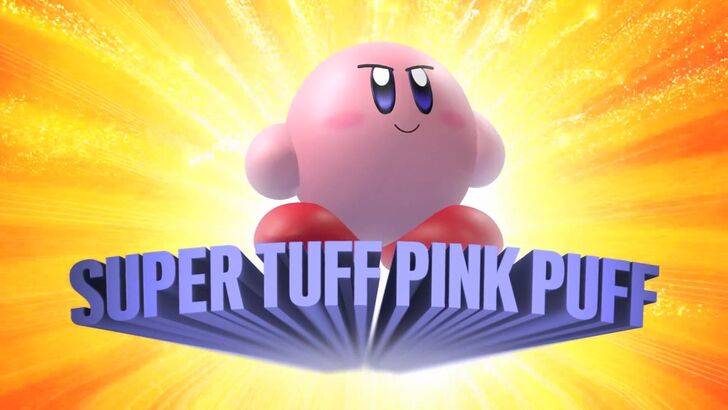
Nintendo's marketing strategy aimed to broaden Kirby's appeal, particularly among boys. The memorable "Super Tuff Pink Puff" tagline for Kirby Super Star Ultra exemplifies this shift. Krysta Yang, former Nintendo of America Public Relations Manager, reveals that Nintendo sought to shed its "kiddie" image, recognizing the stigma attached to games marketed solely towards young children. This led to a conscious effort to emphasize Kirby's combat abilities and downplay his inherent cuteness in promotional materials. While a more well-rounded character image has been pursued in recent years, Yang acknowledges that Kirby's cuteness remains his primary identifier.
Regional Variations in Localization: A Case Study
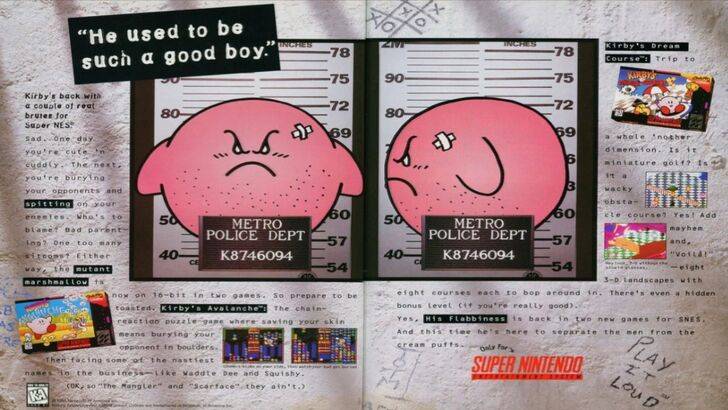
The divergence in Kirby's image between Japan and the US is evident in various aspects of localization. The infamous 1995 "Play It Loud" mugshot ad, along with the altered facial expressions in games like Kirby: Nightmare in Dream Land, Kirby Air Ride, and Kirby: Squeak Squad, showcase this difference. Even the original Kirby's Dreamland for Game Boy featured a ghostly-white Kirby in the US version, contrasting with the original pink hue in Japan. This was attributed to the Game Boy's monochrome display, but the decision to maintain the altered color in subsequent releases highlights the strategic choices involved.
A Shift Towards Global Consistency
Both Swan and Yang agree that Nintendo has adopted a more globalized approach in recent years. Closer collaboration between Nintendo of America and the Japanese office has resulted in more consistent marketing and localization strategies. This shift aims to reduce regional variations, moving away from past instances like the "Play It Loud" ad and inconsistent box art. While this ensures brand consistency, Yang notes a potential downside: a tendency towards safer, less distinctive marketing. However, the increasing familiarity of Western audiences with Japanese culture may also contribute to this trend, reducing the need for significant regional adaptations.