Civ 7’s Deluxe Edition has been released for just a day, and the online community is already buzzing with opinions about its UI and other potential drawbacks. But is the criticism justified? Let's delve deeper into the game's user interface elements and evaluate whether the feedback matches reality.
← Return to Sid Meier's Civilization VII main article
Is Civ 7's UI as Bad as They Say?
Civ 7 has been available for less than a day for Deluxe and Founder's Edition owners, yet it's already facing criticism, particularly for its user interface and the absence of certain quality-of-life features. While it's easy to join the chorus of detractors, it's important to take a step back and critically evaluate the UI. Let's analyze it component by component to see if it meets the standards expected of a 4X game's interface.
What Makes a Good 4X UI?
The design of a 4X game's UI is a complex topic, as what works well can vary depending on the game's context and goals. However, experts in visual design have identified common traits among the best 4X UIs, providing a framework for evaluating Civ 7's interface.
Let's assess Civ 7's UI based on these key elements:
Clear Information Hierarchy
A good UI should structure information in a way that prioritizes what's most important for gameplay, making frequently used features easily accessible. In 4X games, essential resources and mechanics should be prominent, while less critical information should be just a few clicks away.
For instance, Against the Storm's building info menus exemplify this principle. Each building's pop-up menu is organized into tabs, with the most common actions—such as worker assignments and production settings—front and center, and less-used features accessible through other tabs.
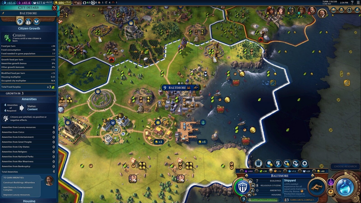
Now, let's examine Civ 7's resource management UI. It provides a summary of resource allocation across your empire, divided into income, yields, and expenses via dropdown menus. The table format makes tracking easy, and the menu can be collapsed without additional navigation. However, it lacks the detailed specificity needed for deeper analysis, such as which specific districts or hexes contribute to resource generation. While functional, it could benefit from more granular detail.
Effective and Efficient Visual Indicators
Visual indicators like icons and color coding are essential for conveying information quickly and efficiently. A well-designed UI uses these elements to reduce the need for text and numbers, allowing players to understand the game state at a glance.
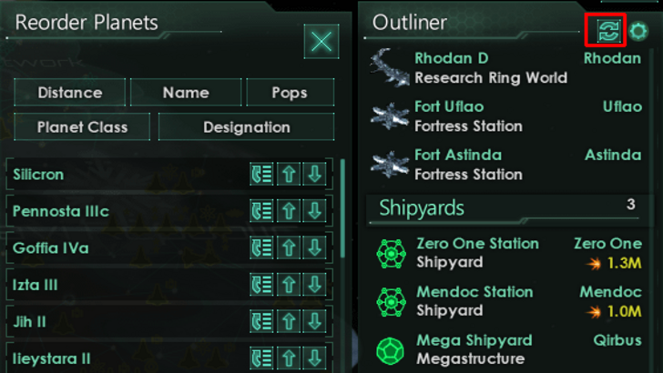
Stellaris's Outliner is a great example, using visual cues to show the status of survey ships and colony needs without requiring extra clicks.
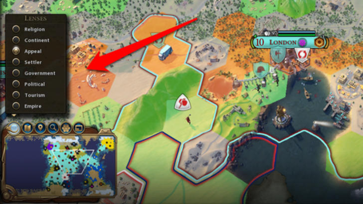
Civ 7 employs iconography and numerical data for resources, along with some effective visual indicators such as the tile yield and settlement overlays. However, the absence of certain lenses available in Civ 6, which relate to unique features, has been a point of contention. Additionally, the lack of customizable map pins is a notable omission. While not terrible, there's room for enhancement in this area.
Searching, Filtering, and Sorting Options
As 4X games can become visually cluttered, searching, filtering, and sorting options are crucial for managing information. These features help players navigate the game more efficiently.
Civ 6's search function is an excellent example, allowing players to locate specific resources or units on the map quickly. Unfortunately, Civ 7 lacks this feature, which is a significant drawback given the game's scale. Hopefully, future updates will address this issue, along with improving the Civilopedia's functionality.
Design and Visual Consistency
The UI's design and visual consistency are crucial as they impact the overall player experience. A cohesive and aesthetically pleasing UI can enhance the game's identity and player engagement.
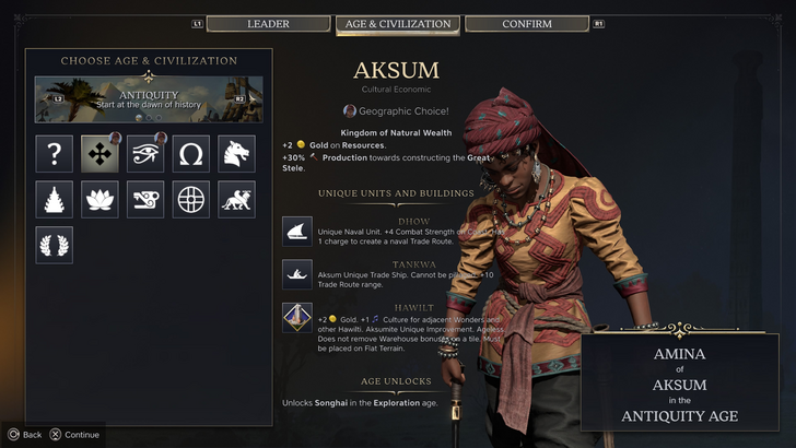
Civ 6's UI, with its dynamic, cartographical style, seamlessly integrates with the game's aesthetic, enhancing the overall experience. In contrast, Civ 7 adopts a more minimalist, sophisticated design with a regal black and gold color scheme. While not lacking in quality, this approach is less visually striking, leading to mixed reactions among players. Visual design is subjective, and while some may appreciate the subtlety, others may find it less engaging.
So What’s the Verdict?
It’s Not The Best, But Undeserving of Such Disapproval
After evaluating Civ 7's UI based on the criteria above, it's clear that while it may not be the most refined, it doesn't deserve the harsh criticism it's receiving. The lack of a search function is a notable flaw, but it's not game-breaking. Compared to other issues in the game, the UI's shortcomings seem minor. While it may not match the visual appeal and efficiency of other 4X UIs, it still has strengths that should be acknowledged.
As a player, I find Civ 7's UI functional enough to enjoy the game. With potential updates and player feedback, it could improve further and win over more critics. For now, I believe the negative reactions are overblown.
← Return to Sid Meier's Civilization VII main article
Sid Meier's Civilization VII Similar Games